Pantone Colors of the Year 2021 and How to Bring Them Into Your Decor
Author: Arianne Daoust-Hébert
Every year, Pantone, the company renowned for its infallible color matching system, identifies a color that will influence trends across several industries, including interior design, graphic design, and fashion.
For 2021, Pantone is feeling generous and unveils TWO colors! Discover the 2021 Colors of the Year, along with tips and tricks for bringing them into your decor.
The first color, PANTONE 17-5104 Ultimate Gray, is a timeless, fairly neutral gray. At first glance, this color may seem monotone and cold. However, paired with the second Pantone color of the year, it is easy to see why it was chosen.
The second color, PANTONE 13-0647 Illuminating, is a vibrant lemon yellow. According to Pantone, these two colors together capture "deeper feelings of soulfulness with the promise of something sunny and friendly." The gray inspires "feelings of serenity, stability and resilience," while the yellow inspires "optimism, vitality and hope." (Pantone website).
In interior design, these colors can feel tricky to work with. Gray on its own can seem dull and boring. Yellow, meanwhile, can feel intimidating. Will it be too bold a color? Will you get tired of it quickly in your home? Here are 3 tips for bringing the 2021 Colors of the Year into your decor:
1- Add yellow in small doses
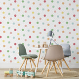
There is no need to paint every wall yellow. By adding small accents, such as accessories (cushions, lamps), an armchair, a rug, a wall decal, or even a peel-and-stick wallpaper, your decor will be lit up without going overboard.


2- Layer in several shades of gray
Rather than painting an entire wall gray, use several shades to create texture, movement, and depth. A photograph or an element with a concrete-look texture can add real interest.


3- Use the colors in the right places
With its vibrance, yellow can bring a kitchen, a playroom, or a home gym to life. As for gray, use it in the bedroom, the living room, or a reading nook to encourage rest and calm.


For more ideas, check out our Pinterest account. We put together a board full of inspiration gathering the best ways to use the 2021 Pantone colors!
Source: https://www.pantone.com/eu/fr/color-of-the-year-2021
-
Posted in
2021, Couleurs 2021, Déco, Décoration intérieure, Pantone